Learn CSS for Beginners: Style Your First Web Page
Learn beginner CSS: apply styles, write selectors, and use colors, fonts, spacing, flexbox, and grid on a real HTML page you built.
If you want to learn beginner CSS, start with the HTML page you already built. I will walk you through styling that page: selectors, colors, fonts, spacing, then a first look at flexbox and grid. If you haven’t read the previous guide, or HTML still feels new, read it first so you can follow along: Learn HTML for Beginners: Create Your First HTML Page.
How do we style our web page?
To style a web page, we need to use a style sheet language alongside our HTML.
Yes, another language… Don’t worry too much about it, it’s better to learn HTML and CSS simultaneously as they’re meant to work together. If you follow along you’ll eventually get the hang of it.
Writing Cascading Style Sheets, or CSS for short, means you select an HTML element and add a property-value pair. To put it into words, it’s like saying:
“Select all <h1> elements, set the color property to the value of blue”.
We will get into how we can add CSS in our HTML, don’t add the below code yet if you don’t know what you’re doing.
To put the words into code, it looks like this:
h1 {
  color: blue;
}
or
h1 { color: blue; }or
h1{color:blue;}Write the selector, surround the property: value; syntax with curly braces, and that’s it!
- Selector: h1
- Property: color
- Value: blue
White spaces are ignored, but we will be formatting our CSS for the sake of readability.
If you’re wondering what the “Cascading” in CSS stands for, I bet you’ll figure the appearance of our <h1> tag with this code:
h1 {
  color: blue;
  color: indigo;
}
It’s called cascading because the browser applies our CSS to our HTML elements from top to bottom. That means the bottom-most CSS properties will always overwrite the properties above it, unless we use the !important keyword:
h1 {
  color: blue !important;
  color: indigo;
}
In this case, color: blue !important; will always take precedence and can’t be overwritten… unless:
h1 {
  color: blue !important;
  color: indigo !important;
}
See how it’s getting confusing the more we use the !important keyword? That’s why it’s always recommended to avoid using it entirely, and only use it as a last resort. It will make your debugging easier in the long run if you don’t use it.
Now that the syntax and the keyword of doom is out of the way, let’s actually start applying our CSS.
Ways to apply CSS
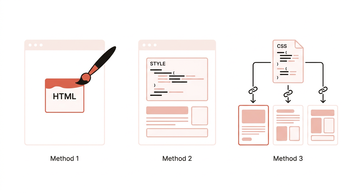
There are three ways to add CSS to a page: inline, embedded, and external. We will go through each one. Same language, different place to put it.
Inline Styles
As the name suggests, CSS is applied to the HTML element inline or directly, via the style=“” HTML attribute:
<h1 style="color: blue;">Welcome to My Website</h1>You can chain multiple properties inside the style attribute like style=“color: blue; background-color: skyblue;” and it will work fine. Notice we don’t include the surrounding curly braces to it.
If you apply the same method to our <p> tag, we can do the same:
<h1 style="color: blue;">Welcome to My Website</h1>
<p style="color: #555555;">Hello, World!</p>
Notice the color value #555555, it’s a hex code. If you haven’t encountered one before, it’s basically a code value of a color, and is usually taken from a color picker. If you are more comfortable with RGB values, you can do that as well, like: color: rgb(85, 85, 85);
Easy right? But why do we have other methods in applying our CSS if inline styles are this straightforward? Well, try applying the same styles on our <p> tag above to the following code:
<h1 style="color: blue;">Welcome to My Website</h1>
<p style="color: #555555;">Hello, World!</p>
<p>From my first web page!</p>
<p>John Doe - CEO</p>
<h2 style="color: indigo;">Likes and Dislikes</h2>
<p>John likes Bread and butter.</p>
<p>He also likes Photography.</p>
<p>He doesn't like his socks to get wet.</p>
<p>He hates flying cockroaches.</p>
As you have guessed, it’s cumbersome. Not only that, but what if we’re chaining our styles?
<h1 style="color: blue; background-color: skyblue; text-align: center; font-style: italic; letter-spacing: -1px;">Welcome to My Website</h1>
<p style="color: #555555; line-height: 18px; letter-spacing: 1px; background-color: coral; font-size: 16px;">Hello, World!</p>
<p style="color: #555555; line-height: 18px; letter-spacing: 1px; background-color: coral; font-size: 16px;">From my first web page!</p>
<p style="color: #555555; line-height: 18px; letter-spacing: 1px; background-color: coral; font-size: 16px;">John Doe<br />- CEO. <a href="https://en.wikipedia.org/wiki/Seven_(1995_film)">Se7en</a></p>
<h2 style="color: #555555; background-color: skyblue; text-align: center; font-style: italic; letter-spacing: -1px;">Likes and Dislikes</h2>
<p style="color: #555555; line-height: 18px; letter-spacing: 1px; background-color: coral; font-size: 16px;">John likes Bread and butter.</p>
<p style="color: #555555; line-height: 18px; letter-spacing: 1px; background-color: coral; font-size: 16px;">He also likes Photography.</p>
<p style="color: #555555; line-height: 18px; letter-spacing: 1px; background-color: coral; font-size: 16px;">He doesn't like his socks to get wet.</p>
<p style="color: #555555; line-height: 18px; letter-spacing: 1px; background-color: coral; font-size: 16px;">He hates flying cockroaches.</p>
A couple of days later, you decided to change the color of your <p> tags and some of its content… good luck!
If you keep your code readable, collaborators and your future self will thank you for it.
If inline styles are so bad, why go through the effort of learning it in the first place?
Because of specific styling purposes.
The general rule is to only use inline styles if you have a very specific style in mind that will only happen once. If you tend to use the style more than once, it’s best to use embedded or external styles instead.
Embedded Styles
Let’s clean up our previous mess since we don’t have anything to do with our HTML in the next examples.
<h1>Welcome to My Website</h1>
<p>Hello, World!</p>
<p>From my first web page!</p>
<p>John Doe<br />- CEO. <a href="https://en.wikipedia.org/wiki/Seven_(1995_film)">Se7en</a></p>

<h2>Likes and Dislikes</h2>
<p>John likes Bread and butter.</p>
<p>He also likes Photography.</p>
<p>He doesn't like his socks to get wet.</p>
<p>He hates flying cockroaches.</p>
As you have noticed on our first example with CSS, we were using a slightly different syntax than that of the inline styles, like this:
h1 {
  color: blue;
}
We can apply this syntax on both embedded and external styles. To apply this as an embedded style, we first create a <style></style> HTML tag and place all our CSS inside it, like:
<head>
  <style>
    h1 {
      color: blue;
    }
  </style>
</head>
<body>
  <h1>Welcome to My Website</h1>
  <p>Hello, World!</p>
  <p>From my first web page!</p>
  <p>John Doe<br />- CEO. <a href="https://en.wikipedia.org/wiki/Seven_(1995_film)">Se7en</a></p>
...
Browsers will still apply a <style> tag if you drop it in the body, but put it inside the <head>. That is where it belongs.
If we were to convert what we did on the first inline styles examples, our code ends up like this:
h1 {
  color: blue;
}

p {
  color: #555555;
}
Compare that to our last inline styles example, we get a significantly readable HTML and CSS code while achieving the same effect.
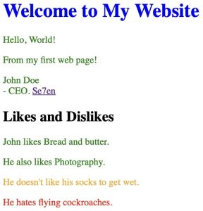
What if we combine both inline and embedded styles in one page, what will happen? The inline style takes precedence. If you view the following code for example:
<style>
    h1 {
      color: blue;
    }
    p {
      color: green;
    }
  </style>
</head>
<body>
<h1>Welcome to My Website</h1>

<p>Hello, World!</p>
<p>From my first web page!</p>
<p>John Doe<br />- CEO. <a href="https://en.wikipedia.org/wiki/Seven_(1995_film)">Se7en</a></p>

<h2>Likes and Dislikes</h2>

<p>John likes Bread and butter.</p>
<p>He also likes Photography.</p>
<p style="color: orange;">He doesn't like his socks to get wet.</p>
<p style="color: red;">He hates flying cockroaches.</p>
You’ll see that the inline styles we added for the last two <p> tags will overwrite the embedded CSS we added for all the <p> tags.
Not to conjure the devil or anything, but what happens if we add the !important keyword in our embedded CSS for the <p> tags? Like this:
p {
  color: green !important;
}
It will take precedence over the inline style we applied. It messes up the natural order of things, it loves chaos, so it’s better to keep it hidden deep within the bowels of the earth.
Now, it’s pretty obvious that this method is better than inline styles if you are planning to apply the same styles on multiple elements, but how about external styles, why bother?
Here’s the catch, embedded styles stay within the page where you added it. If you have more than one page, you have to copy the <style> tag and its CSS styles again to that page, do the same if you have more. If you need to update the CSS, you have to update every single page. We’re seeing a similar pattern with the issues of inline styles, and that is repeating yourself.
That is where external styles come in.
Don’t Repeat Yourself (DRY): a principle in programming which we can also apply in our CSS. Basically it makes maintaining code easier since we only have to update the single source of repeatable code we implemented. You can read more about it here.
When should I use embedded styles then? Similar to the issues of using inline styles, use embedded styles if you plan to style multiple elements only specific to that page.
Say, if you have a base font size of 16px site-wide, and you have this specific page where the <p> tags must have a 20px font size — like a landing page — then embedded styles should be used to overwrite the existing external styles.
It is still recommended to use external styles entirely, though, even on the aforementioned landing page example. Why? Oh you’re stubborn huh? Short answer: code optimization. It’s an advanced topic, but just know that it’s easier to optimize code if your CSS is in its own file rather than embedded or inline.
External Styles
What do you call a fashion trend that only exists outside your house? External style…
Jokes aside, external styles means putting all your CSS styles in a .css file and linking that file inside our HTML page.
To do that, we will be using the <link> HTML tag inside our <head> tag, like this:
<head>
  <link rel="stylesheet" href="style.css">
</head>
Behind the scenes, I created a style.css file in our project root, where our index.html is located.
Basically, the <link> tag links or “imports” the .css file into our HTML page. That in turn imports all the styles we placed in our CSS file:
style.css
h1 {
  color: blue;
}
p {
  color: #555555;
}
The href="" HTML attribute takes a file path, in this case, since our .css is at the same level as our .html file, we only pass in its file name and extension.
You can pass files that are located inside a sub folder, or outside the current level the .html file is in. Here’s a quick example from w3schools. We will be dealing with complex file structures on some intermediate topics later on, but to keep things simple in this series of beginners guide, let’s place all the files within our project root.
Now, you only have to copy the single line <link> tag to all other pages. If there’s a need to update the CSS for our h1 tag for example, we do it in the source CSS file and all of the pages get updated. Pretty neat right?
Like in our previous examples, what happens if we combine inline, embedded, and external styles?
Inline styles will still take precedence, but the embedded or external styles follows the order in which you have placed them. The last external or embedded style will overwrite everything above it. Try it out and see for yourself!
<link rel="stylesheet" href="style.css">
<style>
  p {
    color: deeppink;
  }
</style>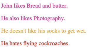
<style>
      p {
        color: deeppink;
      }
    </style>
    <link rel="stylesheet" href="style.css">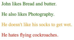
There’s no limit to the number of external styles you can add to your page, just remember that the latest (bottom) styles will overwrite all the styles above it.
Previously we covered the basics of CSS: what it is and how to use them on our web page. Now, let’s talk about common CSS selectors and properties to learn more about what we can do with it.
CSS Selectors
We have learned how to apply CSS to our page and changed some colors to our HTML elements. We have learned that we can apply the same styles to all elements of the same type with embedded and external styles. We have also learned that styling a specific element can be achieved with inline styles. But what if we only want to target a number of tagged elements for styling? In our page for example, if we have a hundred <p> tags on it, how do we change ten specific <p> tags without repeating the CSS code? We can’t rely on inline styles since it will force us to repeat the code. That is where HTML attributes like the class=“” attribute comes in. Let’s clear up our style.css file so we start with a page with no styles applied.
<h1>Welcome to My Website</h1>
<p>Hello, World!</p>
<p>From my first web page!</p>
<p>John Doe<br />- CEO. <a href="https://en.wikipedia.org/wiki/Seven_(1995_film)">Se7en</a></p>
<h2>Likes</h2>
<p>John likes Bread and butter.</p>
<p>He also likes Photography.</p>
<h2>Dislikes</h2>
<p>He doesn't like his socks to get wet.</p>
<p>He hates flying cockroaches.</p>
I made some adjustments to my index.html file to separate the likes and dislikes section.
Targeting the class
If we decided to make all the paragraph tags under the “Likes” section green, and all under “Dislikes” orange, we add a class to the tags:
<h2>Likes</h2>
<p class="text-green">John likes Bread and butter.</p>
<p class="text-green">He also likes Photography.</p>
<h2>Dislikes</h2>
<p class="color-orange">He doesn't like his socks to get wet.</p>
<p class="color-orange">He hates flying cockroaches.</p>
Then we add the following code to our CSS file:
.text-green {
  color: green;
}
.color-orange {
  color: orange;
}
The code above as expected will only target the elements with the matching classes. The syntax for targeting a class is .class-name with a dot (.) before the class name.
Targeting the id
We use the hash symbol (#) before the identifier name to target an element with an id="" attribute like #section-title.
<h2 id="section-title">Likes</h2>
<p class="text-green">John likes Bread and butter.</p>
<p class="text-green">He also likes Photography.</p>
<h2 id="section-title">Dislikes</h2>
<p class="color-orange">He doesn't like his socks to get wet.</p>
<p class="color-orange">He hates flying cockroaches.</p>#section-title {
color: blue;
}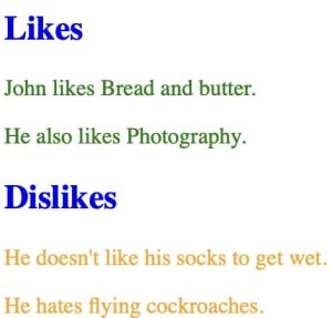
Similar to the class attribute, if we have multiple elements with the same identifier, it will apply the style to all of them. CSS-wise, the code above works, but the usage of the id attribute is WRONG. According to the HTML spec, an id attribute should be unique throughout the page. We used the same section-title identifier on two <h2> elements which isn’t allowed, but CSS couldn’t care less, it still applies the style to both of them. To keep this guide from wandering outside CSS, we will not be covering how the id attribute works, just keep in mind that an identifier must be unique throughout your HTML page. If you’re planning to select multiple elements, stick with the class attribute and leave the id attribute for special cases.
Other CSS Selectors
Targeting the class and id attributes are so common that they use a special character to easily select them, but we are not limited to dots and hashes. There are a lot of CSS selectors for special use-cases but is outside the scope of this guide. We will encounter some of them later, but to show you a bit of its power, check the following example:
<ul class="my-list">
  <li>List Item 1</li>
  <li>List Item 2</li>
  <li>List Item 3</li>
  <li>List Item 4</li>
  <li>List Item 5</li>
</ul>
If we plan to style the last item on the list, we ought to add a class to the last element and add the corresponding style.
<ul class="my-list">
  <li>List Item 1</li>
  <li>List Item 2</li>
  <li>List Item 3</li>
  <li>List Item 4</li>
  <li class="target-item">List Item 5</li>
</ul>.target-item {
font-weight: bold;
}If we add more items at the end of the list, we would have to update the class on the elements, and this goes on and on every time we update the list. What if we don’t have access to the HTML page, or worse, we are tasked to style a page that is dynamically generated from a database? Use a pseudo-class:
<ul class="my-list">
  <li>List Item 1</li>
  <li>List Item 2</li>
  <li>List Item 3</li>
  <li>List Item 4</li>
  <li>List Item 5</li>
</ul>.my-list li:last-child {
font-weight: bold;
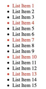
}The CSS code means: Select the last <li> element using the :last-child pseudo-class from .my-list. Here are more pseudo-classes for a list:
- :first-child - Select the first child.
- :nth-child(3) - Select the third child.
- :nth-child(odd) - Select the odd children.
- :nth-child(even) - Select the even children.
- :nth-child(3n) - Select every multiple of 3 children (3rd, 6th, 9th…).
- :nth-child(3n + 1) - Select every multiple of 3 children starting from the first (1st, 4th, 7th…).
This is just the tip of the iceberg and there’s more to learn, but let us not get ahead of ourselves. I promise we will encounter more later in advanced topics, but for now, let’s learn little-by-little to cover web development as a whole.
CSS Properties
We have only covered a few of the CSS properties on our examples above, and I’m not planning to list every single CSS property available in this guide since it is already well-documented elsewhere like MDN’s CSS Reference. You already know the basic syntax of CSS properties, but to give you an overview of the properties and their values, let’s start from the most common ones.
Colors
You never talk about styles without talking about colors. To summarize, everything you see in an HTML document can be colored: text, background, borders, shadows, forms, you name it. Whatever property you’re trying to color, you can define it a number of ways. Let’s cover the most common ones:
- Keyword - black, white, lime, and red are a few examples. You can check out MDN’s CSS Named Colors for the full reference of available named colors.
- RGB -
rgb(0, 0, 0),rgb(255, 255, 255),rgb(0, 255, 0), andrgb(255, 0, 0). The values use a functional syntax. From left to right, we have R, G, and B, each ranging from 0 to 255. Those four RGB values match the keywords black, white, lime, and red. The keyword green is a darker shade (#008000), so use lime when you want full-strength green. - Hexadecimal -
#000,#FFFFFF,#00FF00, and#F00. These are the same colors as our keyword and RGB examples above. Like RGB, the hexadecimal syntax takes R, G, and B starting from the left, with digits ranging from 0 to F (0, 1, 2, 3, 4, 5, 6, 7, 8, 9, A, B, C, D, E, F). Watch for two forms: the short#{R}{G}{B}and the long#{RR}{GG}{BB}.
Aside from the keyword syntax, we can add alpha values to our RGB and hexadecimal colors:
- RGBA -
rgba(0, 0, 0, 0.5). The alpha value for the rgba() color function ranges from 0.0 to 1.0, where 1.0 is the most opaque. - Hexadecimal with alpha channel -
#ff000088which follows the#{RR}{GG}{BB}{AA}or#{R}{G}{B}{A}syntax.
Here are some examples:
.panel {
    /* Sets the background color of an element. */
    background-color: coral;

    /* Sets the text color of an element and its children. */
    color: #2e1d44;

    /* Sets the border color of an element. */
    border-color: rgb(54, 22, 4);
}
Text and Fonts
In addition to HTML’s text formatting tags, we can also control the appearance of our text via CSS. In fact, our browsers apply a default CSS style to some of the HTML tags. The browser applies a font weight of bold to the <strong> tags for example. With CSS, we can do a lot than HTML tags can offer:
- Size:
font-size: 16px;font-size: 2rem;font-size: 80%;. - Weight:
font-weight: bold;font-weight: normal;font-weight: 900;. - Style:
font-style: italic;font-style: normal;. - Line height (leading):
line-height: 18px;line-height: 1.5rem;line-height: 1.65;. - Letter spacing (tracking):
letter-spacing: 1px;letter-spacing: -0.5px;. - Decoration:
text-decoration: underline;text-decoration: line-through;. - Font:
font-family: Helvetica;font-family: Helvetica, sans-serif;.
These are the most common properties for changing your text and font’s appearance. Setting the font family is a bit confusing at first look. Its basic syntax is font-family: {font name}, {fallback}, {fallback};. Starting from left to right, if the left-most font is not available (either on your site or on your machine), it falls back to the next font family on the right. In our example, if Helvetica is not available, it falls back to sans-serif: the browser’s default sans-serif font.
.panel {
    /* ... continued */

    font-family: 'Helvetica', sans-serif;
    font-size: 18px;
    font-weight: 400;
    /* The line height will be 165% of the font size. */
    line-height: 1.65;
}
Size and Spacing
When working with CSS, you’ll be working a great deal with size and spacing. Setting an element’s max width, setting its left margin, changing its padding are just the few examples. Before we go further, you may have noticed the values and units we have used on the text and font properties above. These are px, rem, and %.
- px - Pixel is an absolute length unit and refers to each pixel of your screen. There are other absolute length units available like cm and in but px is widely used when dealing with absolute sizing.
- rem - A relative length unit based on the root’s (browser) font size. This is commonly used for setting the font size to make readability accessible. You may be surprised that a lot of users set their browser’s default font size. Setting your
<html>font size to an absolute value (16px for example) will overwrite their preference, that’s bad for user experience. There’s also em that is relative to the parent element’s font size, and vw and vh which is relative to the viewport’s (screen) width and height respectively. - % - The percentage unit may seem obvious to you but where does it base its value on? A lot of users skip knowing how percentage works in CSS, which in turn leads to confusion as they start using it. The percentage value is relative to an element’s parent, if your element is inside a 1000px
<div>element, setting its size to 50% will calculate to 500px.
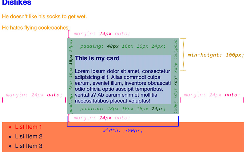
Like with text and fonts, we can use the different length units to set our element’s size and spacing. Let’s create a simple HTML card to visually represent the properties we are going to use.
<div class="card">
  <h3>This is my card</h3>
  <p>Lorem ipsum dolor sit amet, consectetur adipisicing elit. Alias commodi culpa earum, eveniet illum, inventore obcaecati odio officia optio suscipit temporibus, veritatis? Ab earum enim et mollitia necessitatibus placeat voluptas!</p>
</div>.card {
margin: 24px auto;
padding: 48px 16px 16px 24px;
width: 300px;
min-height: 100px;
/* Color to spice it up. */
background: lightsteelblue;
color: midnightblue;
}
.card h3 {
/* Removes heading top margin from card. */
margin-top: 0;
}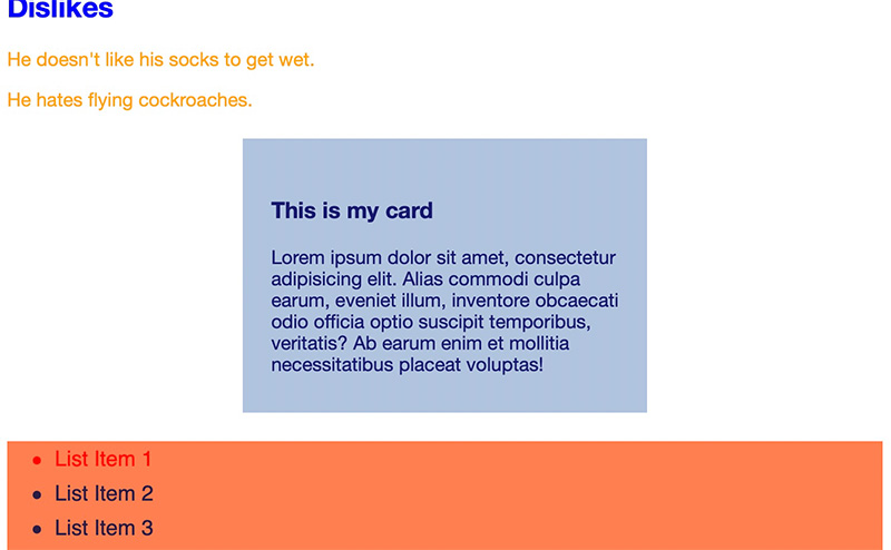
Note how I set the values for both margin and padding properties, it’s a shorthand version for setting the values around the element.
margin: 24px auto;- The syntax is: {top-bottom} {left-right};. Which means 24px for top and bottom, while auto for left and right margin.padding: 48px 16px 16px 24px;- The syntax is: {top} {right} {bottom} {left};. This sets the padding starting from the top, then moves clockwise.
Inline-level elements with padding
Setting a padding to an inline-level element may not behave like you would expect it to.
<p> tag while an <a> tag is inline-level by default. A block-level element will start at a new line, while an inline-level element will sit besides other inline-level elements.Given a line of text with a link wrapped inside a <p> tag, we wanted the link to look like a button so it would stand out.
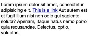
With what we have learned, we normally add a background and a padding to the link to achieve the button appearance:
#unique-link {
    padding: 24px 8px;
    background: greenyellow;
}
Here’s what it looks like:
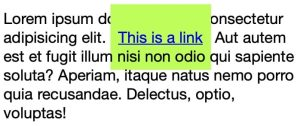
You would expect the text to wrap around the link instead of overlapping. Inline-level elements ignore width and height. They can take padding and margin, but vertical padding and border do not push surrounding lines away the way a block box does, so the background can overlap nearby text. Try it out for yourself: add a width, height, and margin to the link and see what happens. Only block-based elements fully respect the sizing properties we set. We can set the link to a block-level element via CSS, but it would take its own line and break the text block’s continuity.
#unique-link {
    padding: 24px 8px;
    background: greenyellow;
    display: block;
}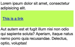
As you may have noticed, since it’s now a block-level element, it would take 100% width and accounts the padding we set to it, but it is in its own line like block elements behave. By default, HTML elements are only either block-based or inline-based, but with CSS, we can have both.
#unique-link {
    padding: 24px 8px;
    background: greenyellow;
    display: inline-block;
}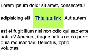
display: inline-block solves the dilemma. It basically makes the element respect the sizing properties we give it, and at the same time sit within inline elements (like text). Since it is also an inline-level element, setting a text alignment property on its parent will affect the inline-block element. This is how you center a button inside a container:
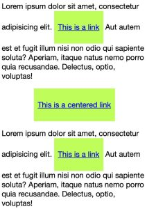
On the above screenshot, the middle button is in its own container.
<p class="narrow-p text-center">
  <a href="#" id="unique-link-2">This is a centered link</a>
</p>.narrow-p {
max-width: 300px;
}
.text-center {
text-align: center;
}margin: 24px auto;. This technique will only work for block elements but not inline-block elements.Set your link’s style to the following to make it a proper button:
#unique-link {
    padding: 6px 10px;
    background: greenyellow;
    display: inline-block;
    color: #000;
    border-radius: 4px;
    border: 2px solid #000;
    text-decoration: none;
    font-size: 14px;
    font-weight: bold;
}
This section got longer than it needs to, but it’s better to understand how sizing works in CSS early on to avoid bugs and know how to fix them.
Layout
We have learned about manipulating colors, text, and sizing, but without the layout properties, we can only do one-column websites. Not that one-column websites are not good web design, but you can’t be a good web developer without mastering CSS layouts. In CSS, layout properties give you the ability to change your elements’ position around the page. By default, HTML elements stack on top of each other, with CSS layouts, we can make two or more sections sit in one row for example. Let’s look at some of the most common layout properties at a higher level for now, since going in detail is reserved for intermediate and advanced guides.
Position
- position: static; - The default position value for all HTML elements.
- position: fixed; - If you want to place an element at a location on the screen and keep it there even if you scroll around the page. Example: Annoying banner ads on shady websites 😉
- position: sticky; - Initially behaves like static, but behaves like fixed once you reach it when scrolling down. Example: sticky sidebar table of contents.
- position: relative; - Flags the element as relative, which works with position: absolute;
- position: absolute; - Positions an element relative to the nearest positioned ancestor (any ancestor with a position other than static). If there is none, it uses the initial containing block for the page. Setting an absolute element’s top and left to -20px, for example, offsets it outside that ancestor’s box. See an example below.
Except for position: static; setting an element’s position to any of the mentioned values can be controlled with the top, right, bottom, and left properties.
.box-1 {
    position: relative;
    width: 200px;
    height: 200px;
    background: #e5e5e5;
}
.box-2 {
    position: absolute;
    top: -20px;
    left: -20px;
    width: 100px;
    height: 100px;
    background: #7777ff;
}
.sticky-sidebar {
    position: sticky;
    top: 20px;
    /* Offsets 20px from the top when the element starts to "stick". */
}
.fixed-ad {
    position: fixed;
    top: 32px;
    right: 32px;
}
Display
We have learned about block, inline, and inline-block display values before, but there’s more to it than just changing how an element behaves. In the past, a lot of people were using display: table to create complex layouts, but it comes with a lot of bugs and is difficult to work with. Today, flexbox and grid make that work much easier.
- display: table; - If you wish to stay in the past.
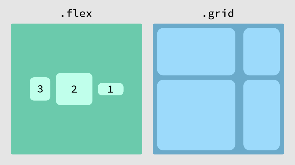
- display: flex; - Turns an element into a flexbox, and distributes its children in one row by default, with widths calculated automatically. Flexbox comes with a number of properties to control its children’s layout, which makes this one of the most useful layout tools.
- display: grid; - Like flexbox, this is powerful enough that you may no longer need a grid-system framework. With grid, you can set columns, rows, and gaps on a parent element, and the children will follow.
There are other display values, but they are not relevant to this guide. Here are some examples with flexbox and grid.
.flexbox {
    display: flex;

    /* Sorts the children in reverse in a row. */
    flex-flow: row-reverse;

    /* Vertically aligns the children at the center. */
    align-items: center;

    /* Horizontally packs the children at the center. */
    justify-content: center;
}
.grid {
    display: grid;

    /* Sets a 3-column grid with equal column widths. */
    grid-template-columns: 1fr 1fr 1fr;
    /* OR */
    /* Sets a 2-column grid where the first track gets twice the free space
       of the second (8fr vs 4fr of the leftover space after fixed sizes). */
    grid-template-columns: 8fr 4fr;

    /* Sets a 24px gap between rows, and 40px gap between columns. */
    gap: 24px 40px;
}
Float
If this is not the first beginner CSS guide you’ve read, you have probably encountered float used to create columns. Before flexbox and grid, float was the standard for complex layouts. Today it is still useful, but I switched to flexbox and grid for page structure, and I only use floats to wrap an image in a text block. To use floats for layouts and avoid bugs, you have to use a utility class called clearfix.
<div class="clearfix">
  <div class="col-1">
    Column 1 content
  </div>
  <div class="col-2">
    Column 2 content
  </div>
</div>.clearfix::after {
content: "";
clear: both;
display: table;
}
.col-1 {
float: left;
width: 80%;
padding-right: 40px;
}
.col-2 {
float: right;
width: 40%;
}Although floats are still not obsolete, I would suggest using flexbox and grid early on to master it. To learn more about CSS flexbox read CSS-Tricks’ A Complete Guide to Flexbox. To learn more about CSS grid read CSS-Tricks’ A Complete Guide to Grid.
Summary
We have covered a lot for a beginner’s guide, and I’m glad you made it through. We covered what CSS is and how to apply it on our HTML pages. We also touched the basics of how CSS works by covering CSS selectors and common CSS properties at a higher level.
If you want a CMS instead of hand-written HTML and CSS, start with Learn WordPress: An Essential Guide For Complete Beginners. More build guides live in the build hub. If you’re stuck or having problems with your code, contact me. I’ll do my best to respond as quickly as possible.
Frequently asked questions
What is CSS?
CSS is the language that styles HTML. You select an element, then set property-value pairs: color, font-size, margin, display. The cascading part means later rules overwrite earlier ones unless you fight that with more specific selectors. HTML is the structure. CSS is how that structure looks on the page.
Should I use inline, embedded, or external CSS?
Use an external .css file for anything you will reuse. Embedded styles in a style tag are fine for one page. Inline styles on the element itself are a last resort for a one-off. Inline wins the cascade, which is why a page full of style attributes becomes painful to change later.
What is the difference between a class and an id in CSS?
A class can sit on as many elements as you want, and you select it with a dot: .text-green. An id must be unique on the page, and you select it with a hash: #section-title. CSS will still style duplicate ids, but the HTML spec says not to. If you need a group, use a class.
Should I learn flexbox or CSS grid first?
Learn both at a high level, then use whichever fits the layout. Flexbox is one-dimensional: a row or a column. Grid is two-dimensional: rows and columns together. I stopped using floats for page layout years ago. Floats are still useful for wrapping an image in text, not for building a two-column site.

Keep reading
How to Choose a Web Stack for a Client Project
How to choose a web stack for a client project. Match WordPress, Laravel, or Astro to the job, then pick hosting and tools that fit.
How to Make a Custom WordPress Theme: Theme Files Essentials
How to make a custom WordPress theme: the files you need, template hierarchy, the Loop, and how starter themes like Underscores fit.
Comments